The redesign of Adventures in the World has been conceived to enhance the user experience, making navigation more engaging and user-friendly. The goal was to capture the true spirit of travel and adventure.

The redesign of Adventures in the World has been conceived to enhance the user experience, making navigation more engaging and user-friendly. The goal was to capture the true spirit of travel and adventure.

Path to the result

Path to the result

Goals

Improve the user experience by making the site more accessible, engaging, and visually appealing. Create an interface that inspires and makes navigation intuitive.

Strategy

Segment content for different age groups and interests (e.g., travel for young people, families, exotic adventures), increasing relevance and appeal for each audience.

Design

The destination cards are organized to provide all relevant information clearly and immediately.

Engagement

Each section guides the user through a visual and emotional journey, facilitating the discovery of destinations and offers.

Inside the process

Inside the process

Find the right trip for you!

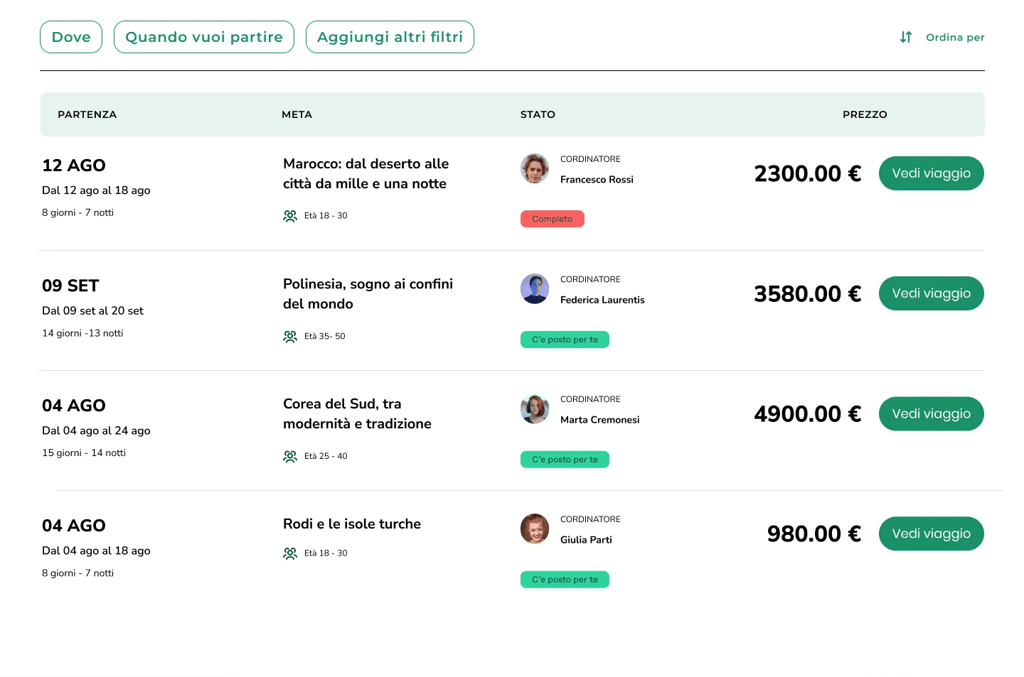
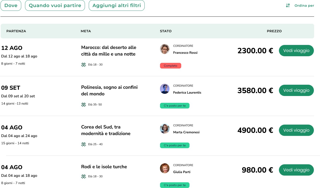
This screen represents a departure table for a specific destination, organized by different dates and age groups. The structure allows the user to quickly view available options and choose the one that best fits their temporal and demographic needs.

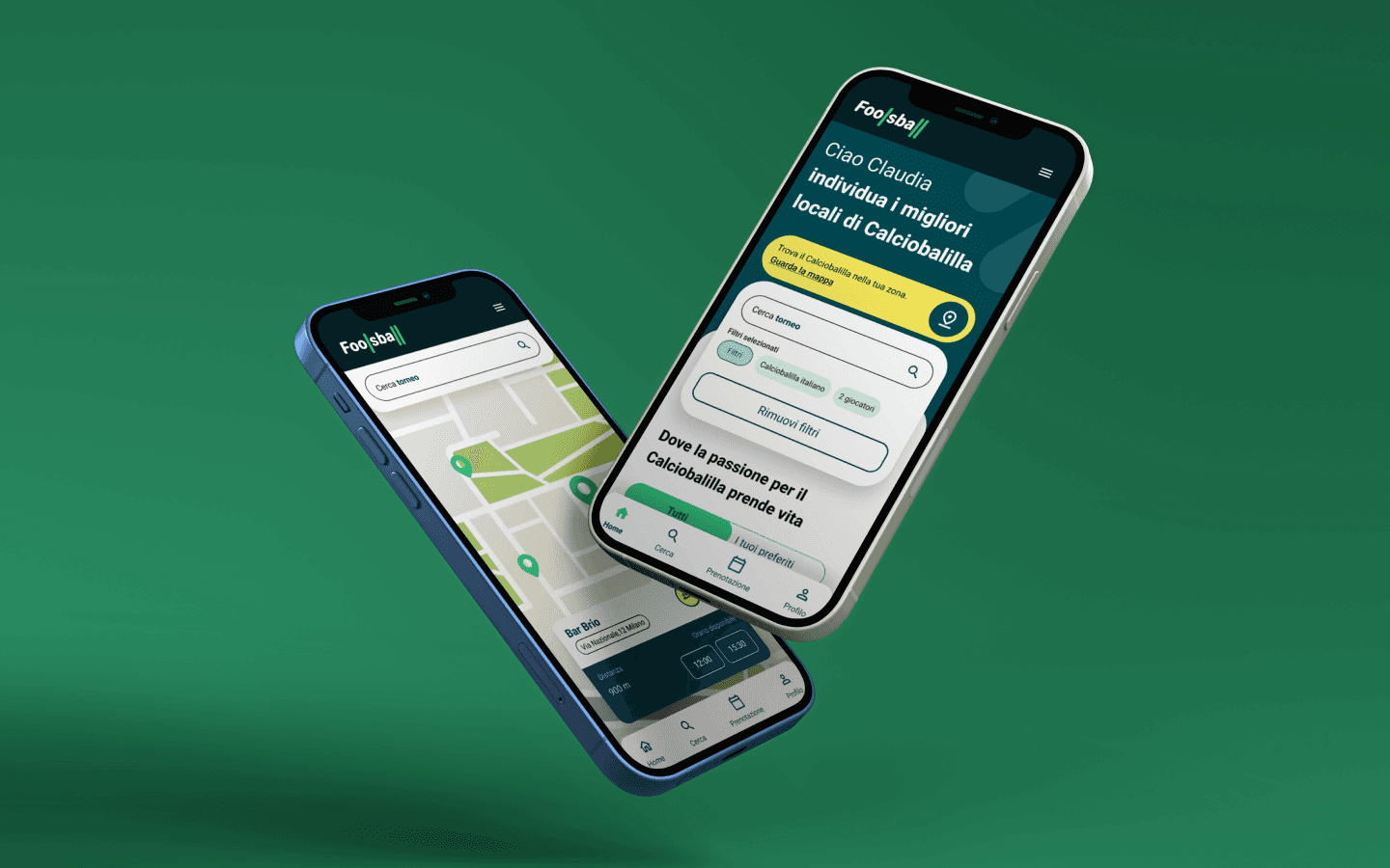
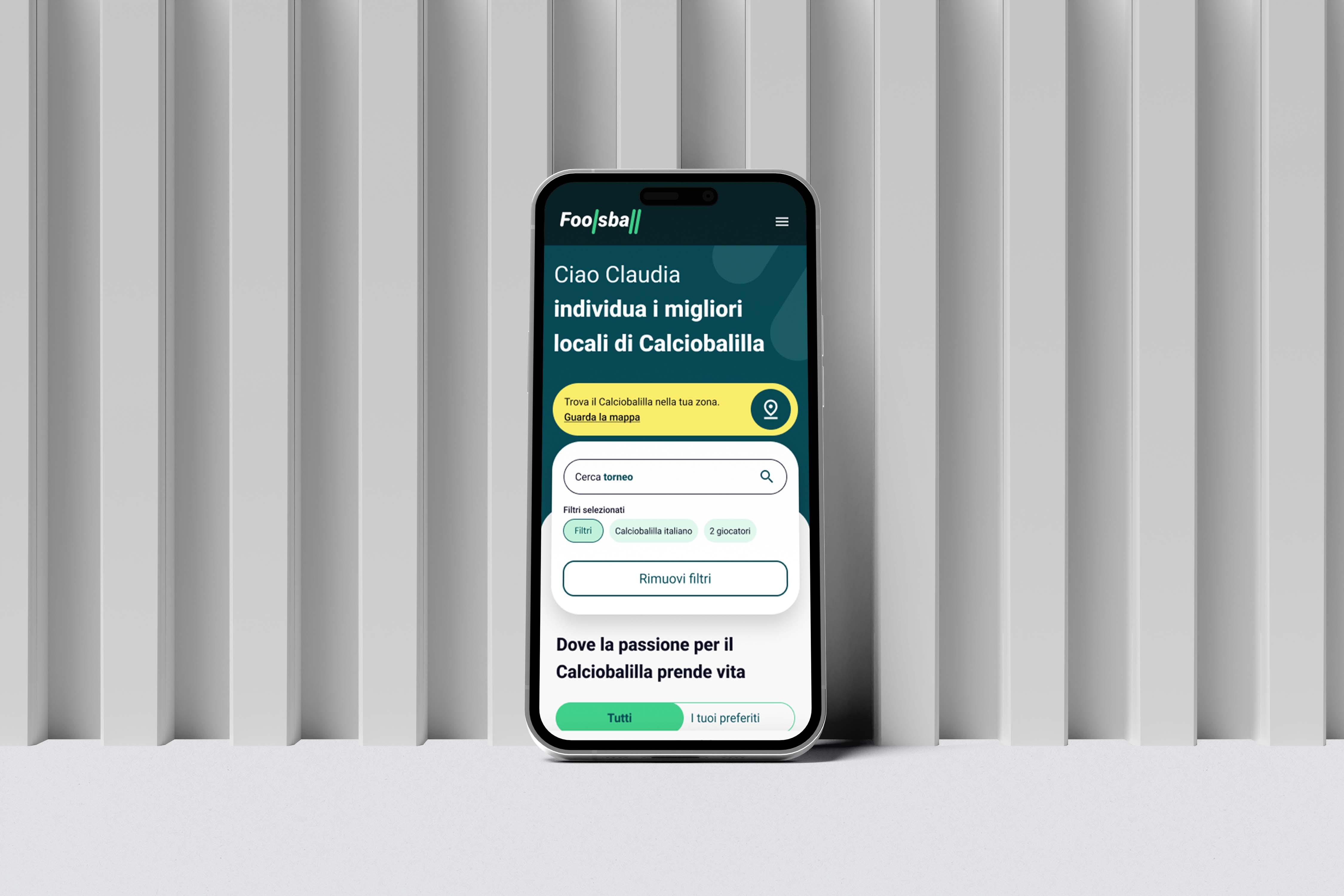
L'app offre una navigazione intuitiva con una hero personalizzata, mappa interattiva e filtri avanzati per trovare locali. Card dettagliate facilitano le prenotazioni, e tornei e sfide coinvolgono la community.

CLARITY

The table features a clear and well-organized layout, with defined columns for departure, destination, status, and price, facilitating information scanning.

COLOR FEEDBACK

The red and green labels provide instant visual feedback. This helps the user quickly distinguish between options.

The red and green labels provide instant visual feedback. This helps the user quickly distinguish between options.

Quick access to information

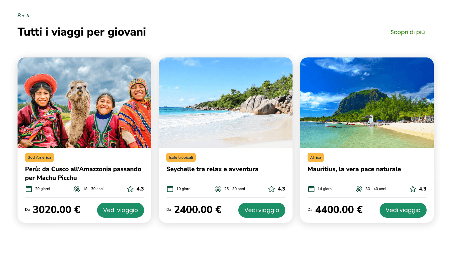
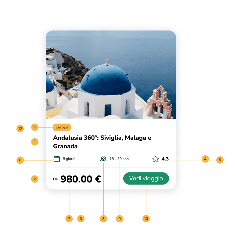
The "Adventures in the World" card is designed for an optimal user experience, blending aesthetics, functionality, and accessibility.

CARD

The entire card structure follows a precise visual hierarchy, guiding the user’s gaze from the most evocative information to the more practical details, ensuring an intuitive and inclusive navigation experience.

Get to the heart of adventure

Get to the heart of adventure

Each element is designed to facilitate immediate access to essential information.
  • Let's build together

  • Let's build together

  • Let's build together